A Unified Branding Concept for a Shared Housing Space, OPRIME
Minimalist Interior Design with a Refined Aesthetic
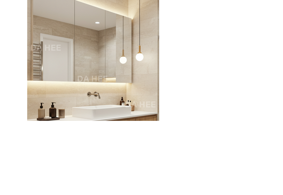
Bathroom interior by DAHEE, OPRIME
Bathroom Space
This bathroom embodies a blend of minimalism and warmth, functioning as a private sanctuary within the practical context of shared living. The combination of natural oak cabinetry and matte beige tiles creates a sophisticated yet calming ambiance, reinforcing a consistent tone and manner across the space.
Material Consistency as a Branding Element By using similar tones of natural wood and beige for cabinetry, wall finishes, and flooring, residents can enjoy a unified brand experience throughout different areas of the home.
Thoughtful Lighting Design Integrated under-mirror and shower niche lighting adds a cozy atmosphere while subtly invoking the elegance of a high-end hotel bathroom.
Refined Minimalism Wall-mounted faucets and built-in shower storage eliminate visual clutter while preserving functionality, enhancing the overall design sophistication.
Shared dining communication kitchen, interior by DAHEE, OPRIME
Shared Dining Table
The second image features a communal kitchen and communication area within the shared house. This space was designed with the idea that even mealtime can support personal and professional growth.
Continuity Through Wall Panel Design The geometric wood paneling echoes the oak tones found in the bathroom, but adds a more intricate pattern to evoke a sense of emotional warmth. This seamless integration of design details subtly reinforces the overall brand identity.
Balance of Curves and Lines Rounded chairs combined with a linear table and gold metal accents strike a balance between softness and elegance, elevating the overall sophistication of the space.
Intentional Use of Negative Space Natural light from the window and a restrained color palette create a visual sense of openness. This communicates a brand message that supports both relaxation and focus.
OPRIME's Branding Process
Color Palette Natural wood + neutral beige + clean white = a harmonious blend of warmth and minimalism.
Material Cohesion Repetition of wood patterns reinforces a unified identity across all spaces.
Lighting Strategy Indirect lighting is used to add a touch of luxury and provide a visually soothing atmosphere.
User-Centered Design Every space is functionally optimized while maintaining a consistent visual identity, ensuring a cohesive brand experience within the shared housing context.